Vizualization types
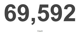
Before the data visualization will be created, first you have to choose the presentation method from an existing list. Currently there are 7 types of visualization. Each of them serves different purposes. If you want to see only the current number of products sold, it is best to choose „Metric”, which presents one value.
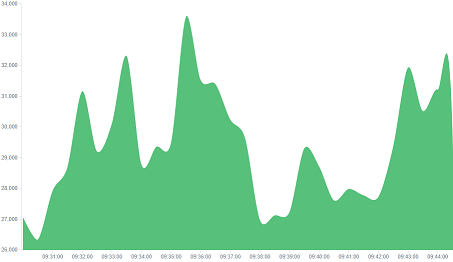
However, if we would like to see user activity trends on pages in different hour and days, a better choice will be „Area chart”, which displays a chart with time division.
The „Markdown widget” views is used to place text e.g. information about the dashboard, explanations and instruction on how to navigate. Markdown language was used to format the text (the most popular use is GitHub). More information and instruction can be found at this link:https://help.github.com/categories/writing-on-github/